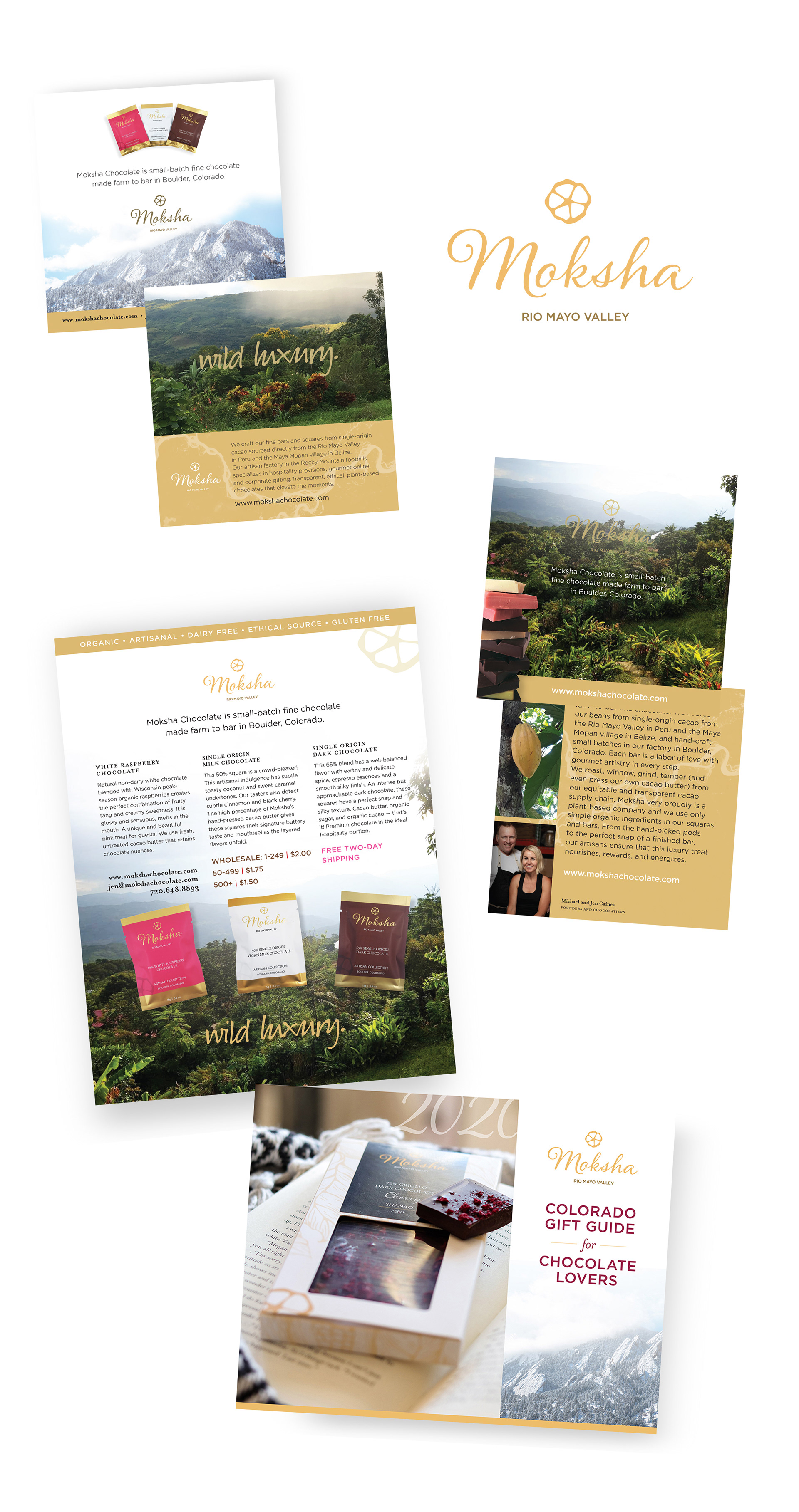
Moksha Chocolate is a Boulder, Colorado craft chocolate company with an organic cacao farm in Shanao, Peru and partners at Corridgeree Belize and elsewhere for "farm to bar" single-origin chocolate bars. I designed their logotype and early print collateral, and various social media and email campaigns, plus wrote and designed a year's worth of marketing and editorial content, product descriptions, and publicity in 2020-21 to establish the brand story, enhance SEO, and finally hand off a well-positioned marketing package to the owners. My evergreen content is sourced continually for promotions and seasonal product releases.
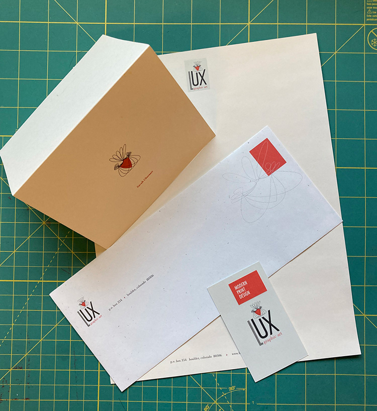
Logo and stationery system for my former print-only design studio in Boulder, Colorado. Inspired by the book cover designs of Alvin Lustig and other mid-century modern print pieces, this cohesive set's whimsical line motif is a playful nod to Chuck Jones' vintage animated short film, The Dot and the Line: A Romance in Lower Mathematics. The business card was embossed and the letterhead de-bossed to demonstrate the tactile possibilities of print design. The paper stocks, from French Paper, were purposely mixed in color and type.
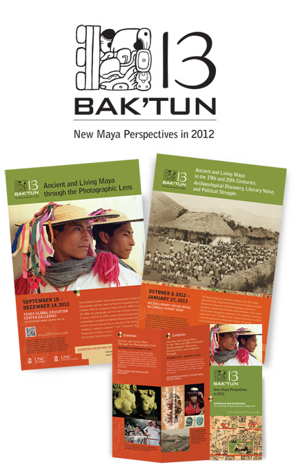
This exhibit and event series celebrated the Mayan calendar's new cycle. I designed the logo and many posters, signage, and the folded brochure — that was designed to echo the dimensions of the folded Mayan codices.
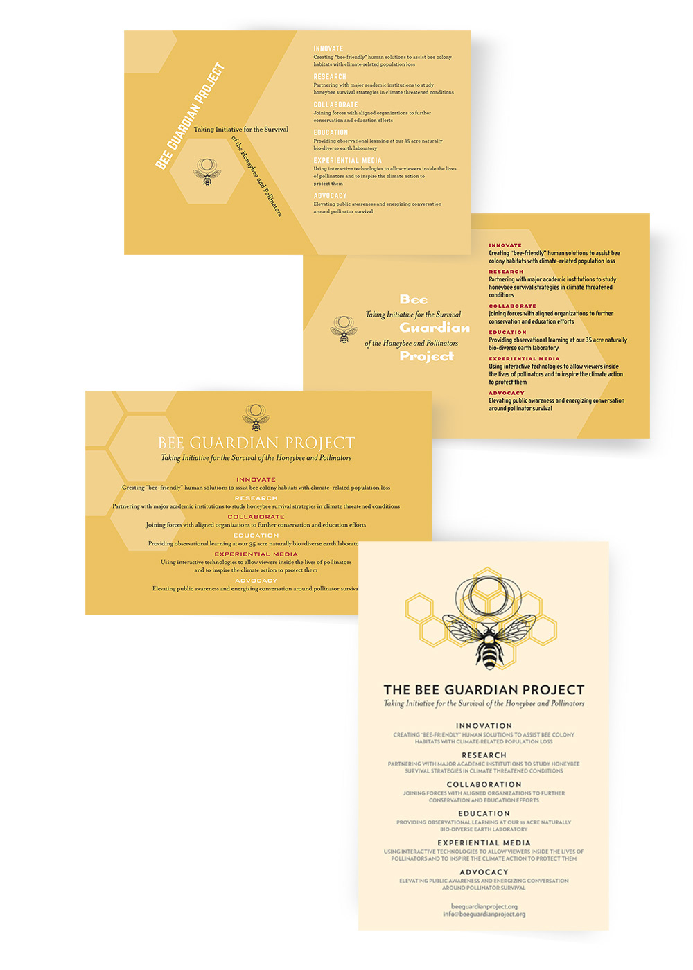
Three initial design iterations plus final (at bottom) of a pro-bono postcard for a fundraising event held at the Highland City Club in Boulder, Colorado. The Bee Guardian Project is a Colorado-based pollinator survival non-profit. (I was provided with the little .png file of the bee and circles.)
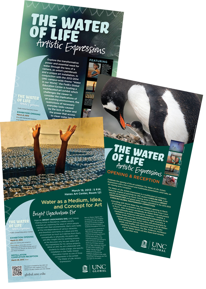
The Water of Life exhibit and events featured the art of Bright Ugochukwu Eke, a Nigerian artist who had an extensive installation at UNC-Chapel Hill. His theme is of global importance: water.
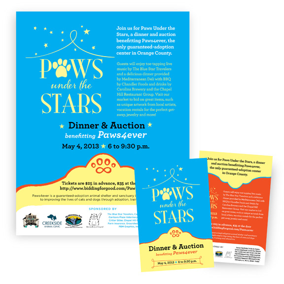
Logo and event marketing materials for Paws4ever, a no-kill animal shelter in Mebane, NC. Pro bono.
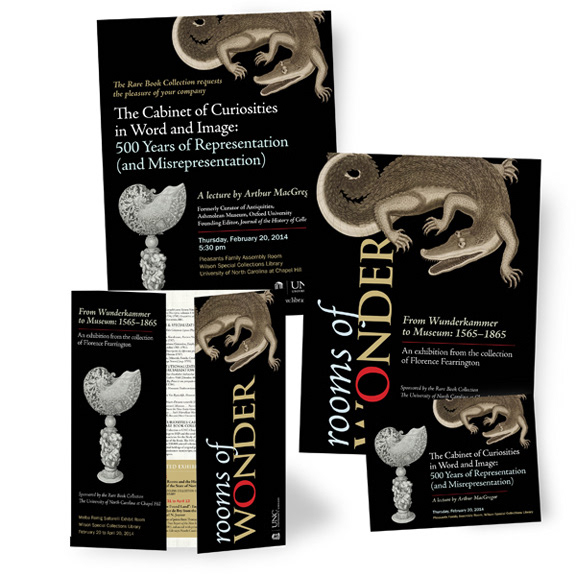
Rooms of Wonder: From Wunderkammer to Museum, 1565-1865 was an exhibit in the Sloane Special Collections library in North Carolina. It explored the history of collecting and its role in the "history of knowledge" from the Renaissance through the mid-nineteenth century.
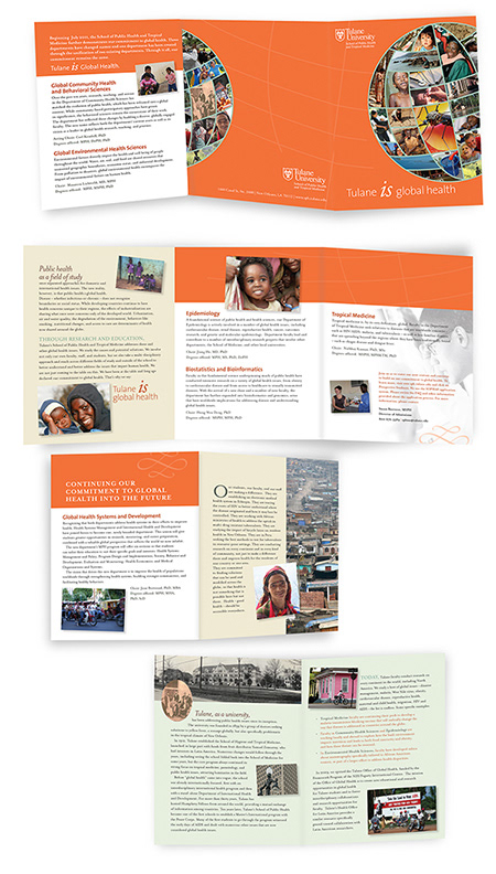
This mini trifold brochure for Tulane was also an eight-page booklet containing the story of the historic New Orleans school and descriptions of its degrees, featuring the signature orange and green globe image that I created for Tulane's "Tulane is public health" campaign of the 2010s.
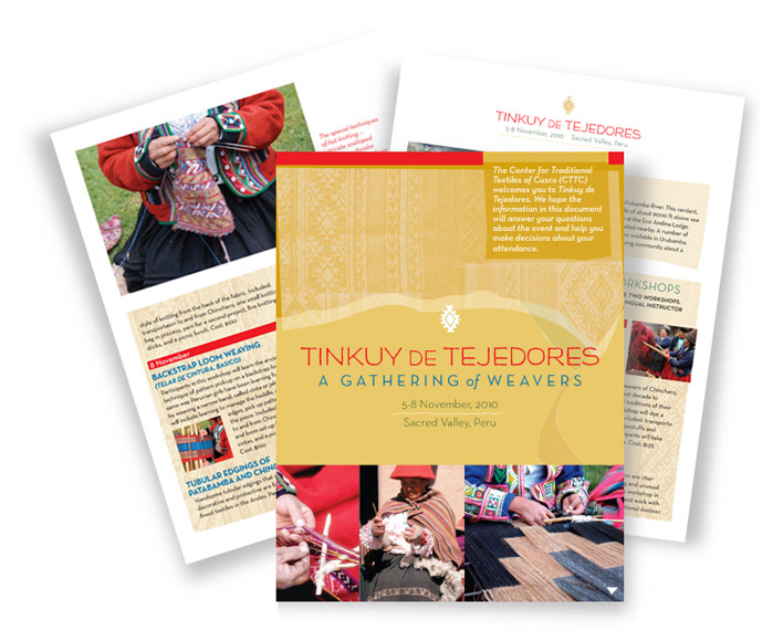
This extensive conference collateral was for a global weaving symposium held in Peru that seeks to preserve cultural clothmaking techniques in traditional cultures.
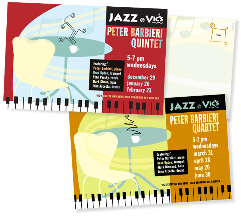
A lighthearted series of postcards to promote free local jazz concerts in a venue known for its eclectic mid-century decor. I took inspiration from Dave Brubeck and vintage album covers.
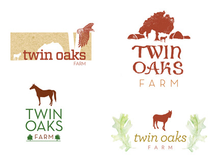
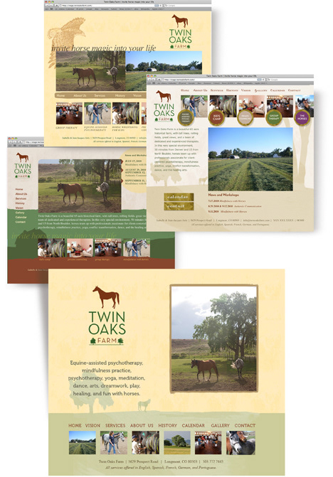
Above, you will see an example of my process and the possibilities that can emerge when designing firstly a logo and then a website. You can see that the clean graphics of the horse and oak trees were the client's choice for a versatile and scalable identity. Twin Oaks Farm continues to thrive in the Boulder-Longmont area as a rural retreat and therapy center, featuring equine-assisted psychotherapy.
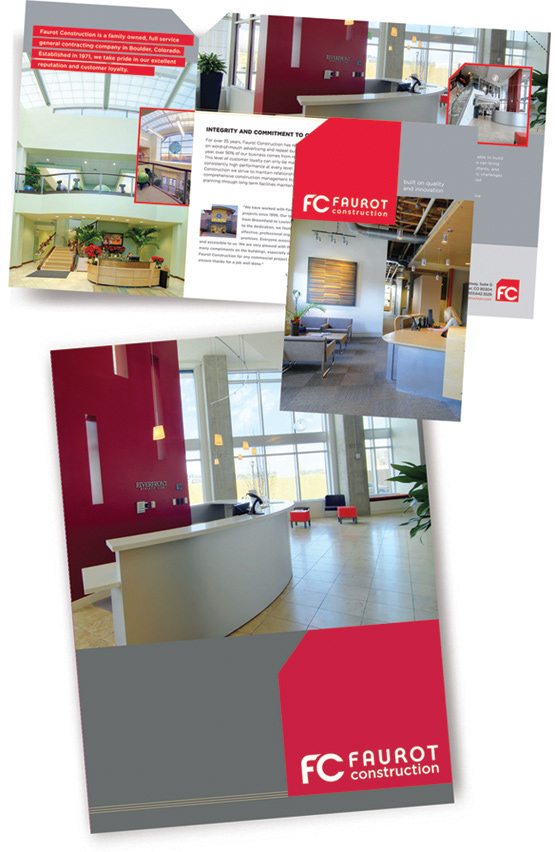
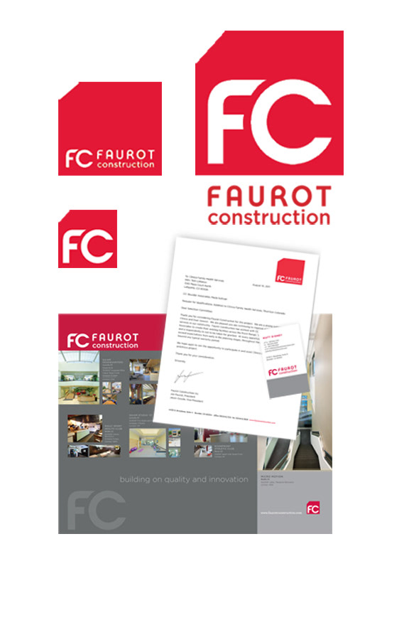
Above, see my logo and collateral for Faurot Construction in Boulder, Colorado, designed in 2007 and used until 2020. From logo to trade show graphics and truck decals, the "notched block" is an iconic logo seen around the Front Range for this successful and seasoned builder.

Logo, informational brochure, and event collateral for the UNC Center for Civil Rights. This center unites many important scholars and law leaders in the area.
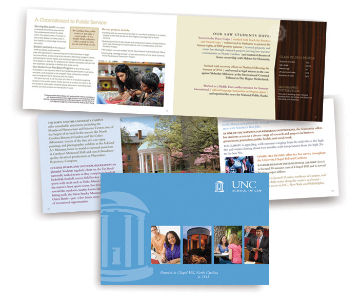
A mini-book for law school recruiters, replete with demographics and statistics to promote UNC Law. Concept to final production.

A custom brochure explaining the dental implant process for an independent oral and maxillofacial surgery office.
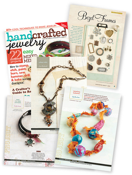
Handcrafted Jewelry was a successful print magazine that pushed the creative boundaries during the maker's movement in 2009.
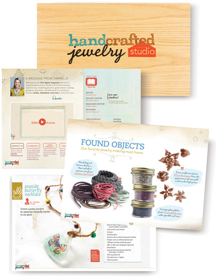
The success of Handcrafted Jewelry in print led to Interweave's first interactive digital magazine by the same name. This tablet-based magazine used the Adobe Air platform.
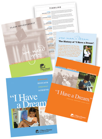
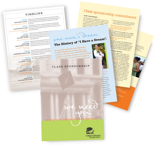
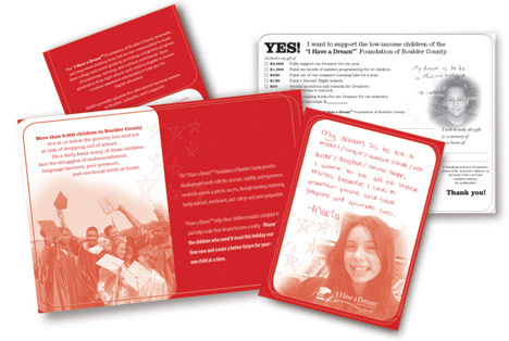
A pro-bono client, the I Have a Dream Foundation of Boulder County coaches at-risk public school students and keeps them on track for graduation success and scholarships. I designed annual reports, sponsor packages, and event material.
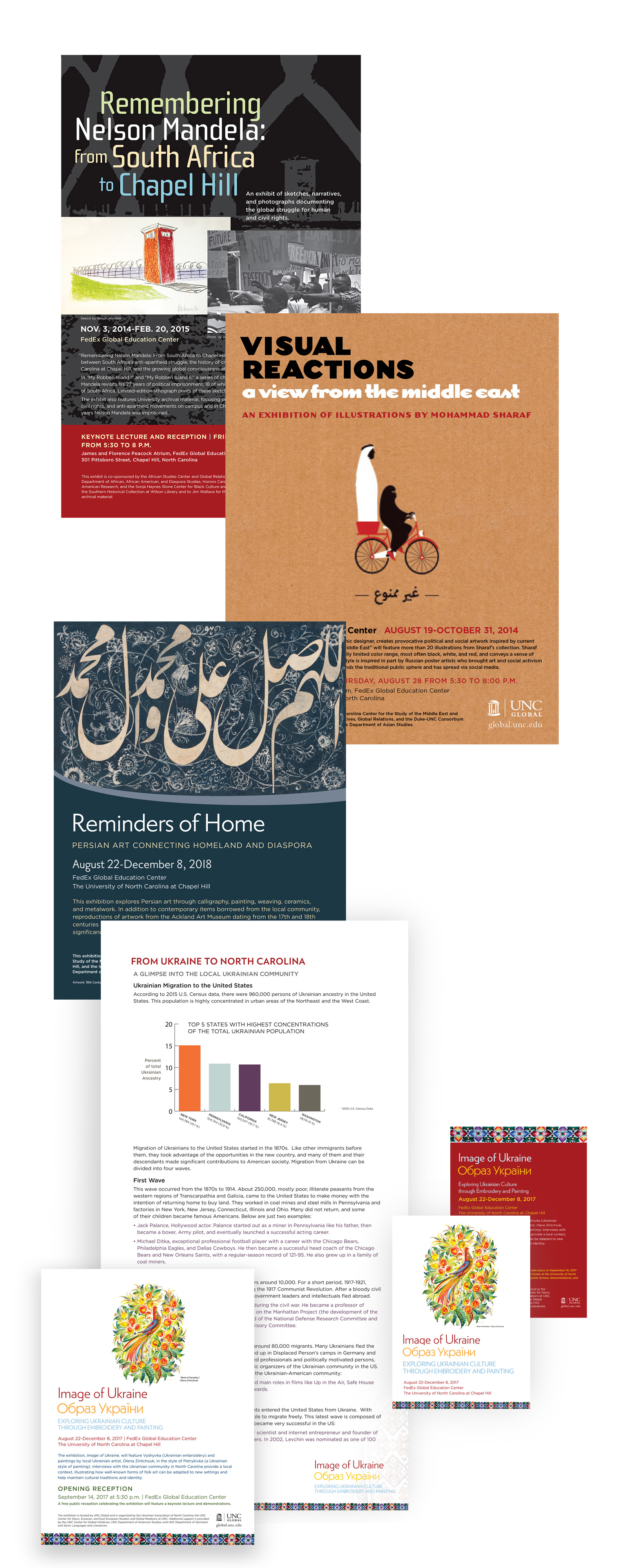
A few of the many UNC Global event projects for which I art directed posters, signage, postcards, and other promotion such as digital ads.
An airy logo for the airway disease council.
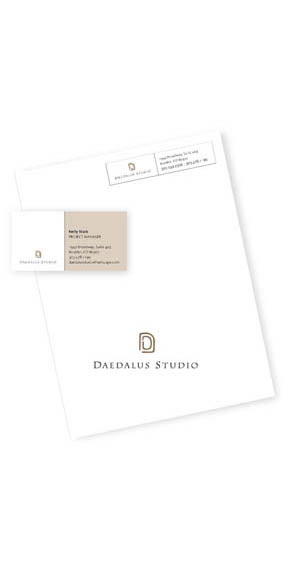
Daedalus Studio is an architecture firm in Boulder, Colorado, that requested a labyrinth concept for its mark.
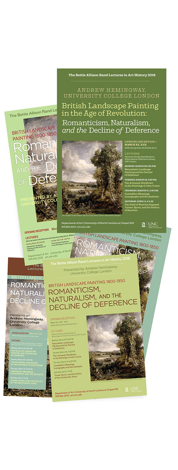
Above, see several versions of a poster design to promote a fine art exhibit of British Romantic artists, featuring John Crome. Final design is on top of the pile.

Pekoe Sip House was Boulder's first tea-focused cafe. Loyalty card, opening invitation, and product description cards.
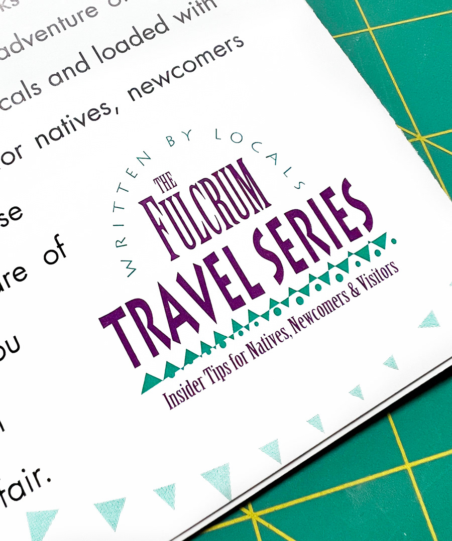
Ready for a little nostalgia by now? This was my first freelance design job! I was a publicity intern at Fulcrum Publishing of Golden, Colorado in the mid 90s as an undergrad at CU. Fulcrum needed an identity and marketing piece/catalog for its travel book titles. I designed this on my Apple Quadra and I believe it was pasted up on boards for the printer. 😀